
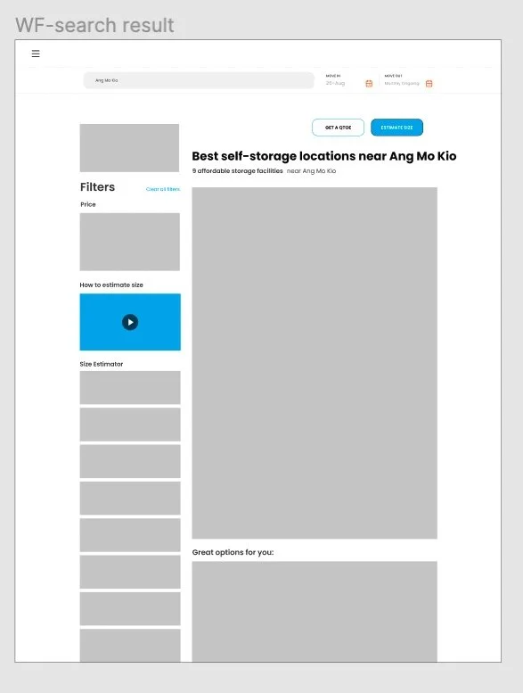
Storage Search Page
Ⅰ. The Overview
My Role : UX Designer
Conducted UX research and created design
(User research, User flow, wireframe, low and high fidelity prototyping)
Tool : Figma, Miro, Overflow
Duration : 01.2021~02.2022

- About Storage Search Page
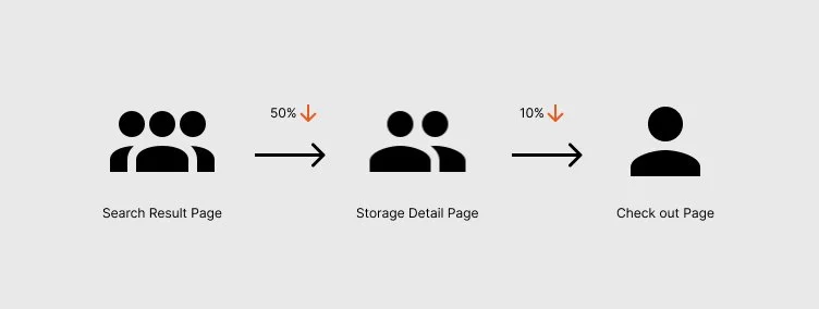
Redesigning storage search page was a part of a self service project from *Space Next Door. Search page was important because it was the 2nd page where users face after searching from homepage. Above all, users can move to the site detail page here which has booking button. The goal is to increase the conversion rate from search page to storage detail page to have more potential customers .
*Space Next Door is a self-storage platform company, which is helping users find suitable self-storage that meets their needs(location, price, amenities)
- The Challenges
Improve the conversion rate from search result page to storage detail page
Redesign the search page to help users find a suitable storage at their needs
Ⅱ. Design Process
While designing this project, I spent time discussing with many people from other teams. I came up with design solutions but making production and deciding channel routes should be considered as a team. I had sufficient communication with developers and marketing team together to apply the design solution for production.
1. Research
We found from the conversion data that more than 50% users didn’t move from search result page to storage detail page for booking. I listened to the sales calls and concluded that we didn’t provide enough information to motivate users to move to the next step for booking.
In addition, If we provide the important information on the website, users can figure out themselves which storage is suitable to them without contacting the sales person.
2. Ideate
Generated user flow based on previous research findings. In the user flow, I put solutions at each step for a better user experience. After that, I drew my ideas through rough sketches and created the wireframe. In the process, I shared ideas with the product manager, UI designer, and developers to make sure there were no issues or find better approaches.
User flow & Wirefrmae
I generated user flow based on predicting how users navigate on the website and what information they need to move to next page. After that, I created wireframe based on the research and user flow. I also checked how to navigate from page to page before creating high fidelity design.

Design Proposal
01. Relocate CTA button on website
I put two important buttons on the top of the page to catch users’ eyes as soon as they navigate to the website. Users will click the ESTIMATE SIZE button to check the right size of the storage unit before they see the details. On the other hand, users, who are confused of what storage is suitable to them, can click the GET A QUOTE button to receive recommended storage unit price.
02. Relocate the video on website
I relocated the How to estimate size video from the bottom of the page to right above the size estimator button. Therefore, users can easily watch the video and get help before they click the size button to sort the storage.
03. Categorize the price list by size
Previously, price list was not grouped by size but it was shown by square feet. This makes it hard for users to see the size and price at a glance. I redesigned it this way to show the price list by grouped size to easily see them so users will not lose their attention. Users can see the different size (S,M,L) first at the left and then check the beginning price of each size group for each facility.