Organization Space
Ⅰ. The Overview
My Role : Product Designer
UX research, Wireframe, UI design, Usability test
Tool : Figma, Miro, Maze
Duration : 10.2022~12.2022(only for Homepage & Tutorial)
- About Organization space
The concept of Org space encompasses a more advanced form of workspaces. Our customers use multiple workspaces to handle a range of projects and people, but encounter challenges when it comes to effectively managing projects and individuals across these workspaces. Org space offers a potential solution for these users, enabling them to efficiently manage people and workspaces without navigating between each workspace.
- The challenges
What is the best way to assist users in quickly identifying task and personnel updates across multiple workspaces on the organization homepage?
How can we efficiently guide both new and existing users to access the organization space and navigate effectively?
Ⅱ. Design Process
Homepage is an important page because it can be a first place our users see when they access. so When I research, I focused on what users want to see first when they login our website. And most important thing was understanding organization space structure, so we can provide important information across workspaces to users.
After research, we discussed with product owners for defining scope for MVP and
also conducted usability test with external users
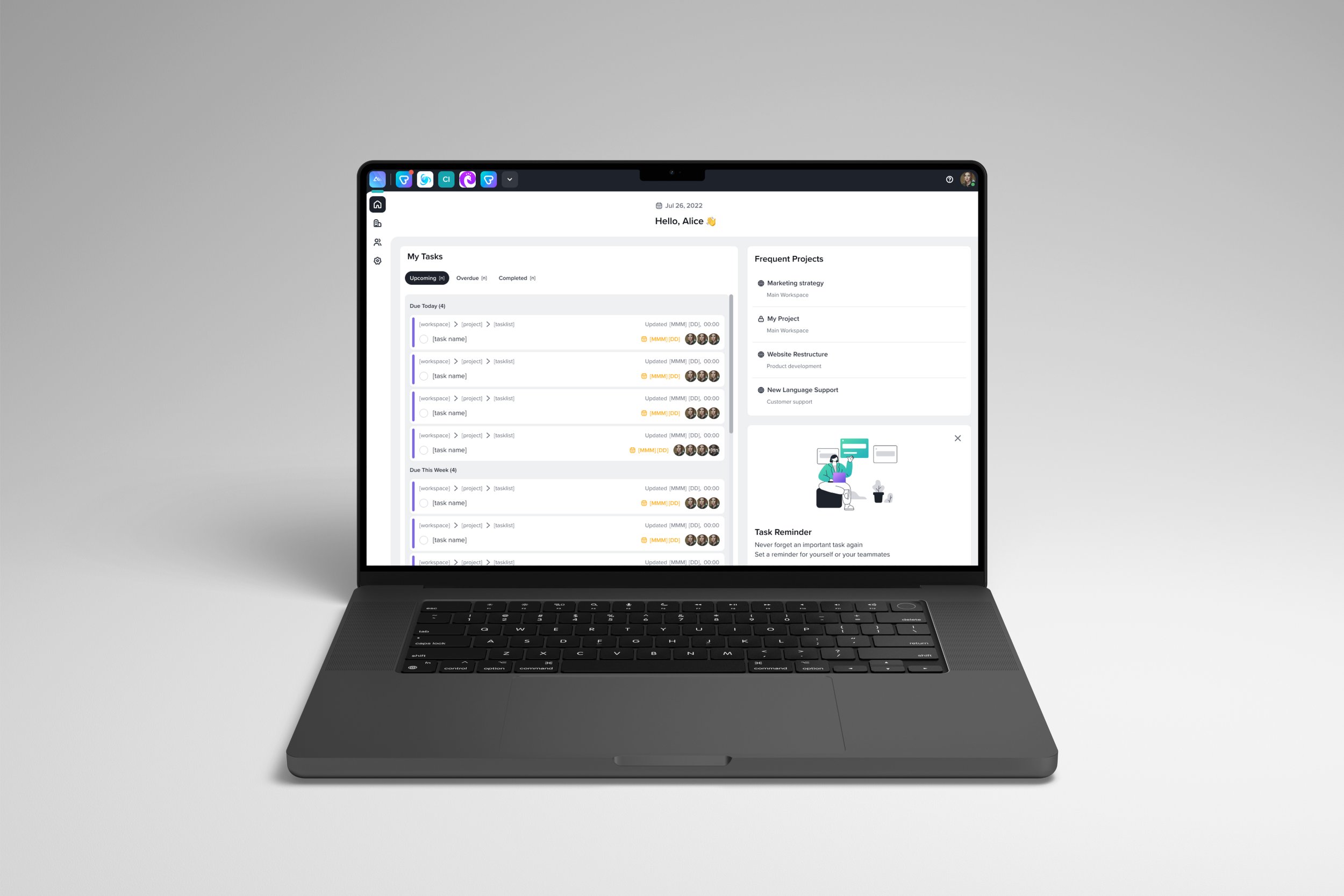
Organization space_Homepage
Internal Survey
As our product is a task management tool that our colleagues use on a daily basis, I conducted internal surveys to gain some ideas before external interview.
The homepage is a central hub where users can view a summary of their various workspaces. Consequently, I conducted a survey to gather insights on the information they frequently check and what they desire to see upon logging in. Their desired feature was an overview of task due dates, progress and task lists without the need to visit each individual workspace.
External Interview
I conducted an interview with a user from a large organization to gain insights into their challenges when it comes to managing multiple projects and teams. the user expressed three key requirements for the homepage:
New Joiner Updates: The user suggested featuring new joiner information on the homepage to ensure that everyone is aware of the updates or remarks for new joiners. which can also help admin aware of the new joiners and adjust permission for them.
Notification and Overview Summary: To assist users in prioritizing their tasks for the day or week, the user recommended including a summary of notifications and an overview on the homepage. This would enable users to quickly skim through their upcoming tasks.
Company Announcements: The user emphasized the importance of efficient communication for important company updates. They proposed a feature that allows administrators to make announcements that reach all members, ensuring that crucial information is not missed.

Scoping & Ideation
We held a meeting with the Product owners to discuss the scope of the homepage. During this discussion, we defined the scope for the Minimum Viable Product (MVP) and devised a plan for additional features in the second phase.
Following our conversation, we proceeded to create a rough sketch to brainstorm ideas for the widget style and determine the specific content to be displayed within each widget. This exercise allowed us to explore different design possibilities and visualize the layout of the homepage.

Prior to creating the widgets, I recognized the significance of revisiting the structure of the organization space. By breaking it down once again, I gained a comprehensive understanding of the information within each workspace and identify the key data that users would require on the homepage, considering the integration of this data. This step was crucial in ensuring that the widgets we develop align with the users' needs and effectively present the relevant information.

Design
The "My Task" widget displays an overview of tasks assigned to the user across multiple workspaces. By incorporating this widget on the homepage, users can conveniently and efficiently review all tasks assigned to them without the need to visit each individual workspace. It enables them to quickly skim through and access their assigned tasks.
The "Frequent Projects" widget showcases four lists of the user's most frequently visited projects across all workspaces. The frequency is determined by calculating the total number of visits over the lifetime of the user's account. It is important to note that archived projects are excluded from being considered as frequent projects.
The purpose of the "Tips & Tricks" widget is to offer users valuable insights and practical advice on effectively utilizing our product. This widget serves as a resource to assist users in maximizing their productivity and efficiency while using our platform.

2. Organization space_Tutorial
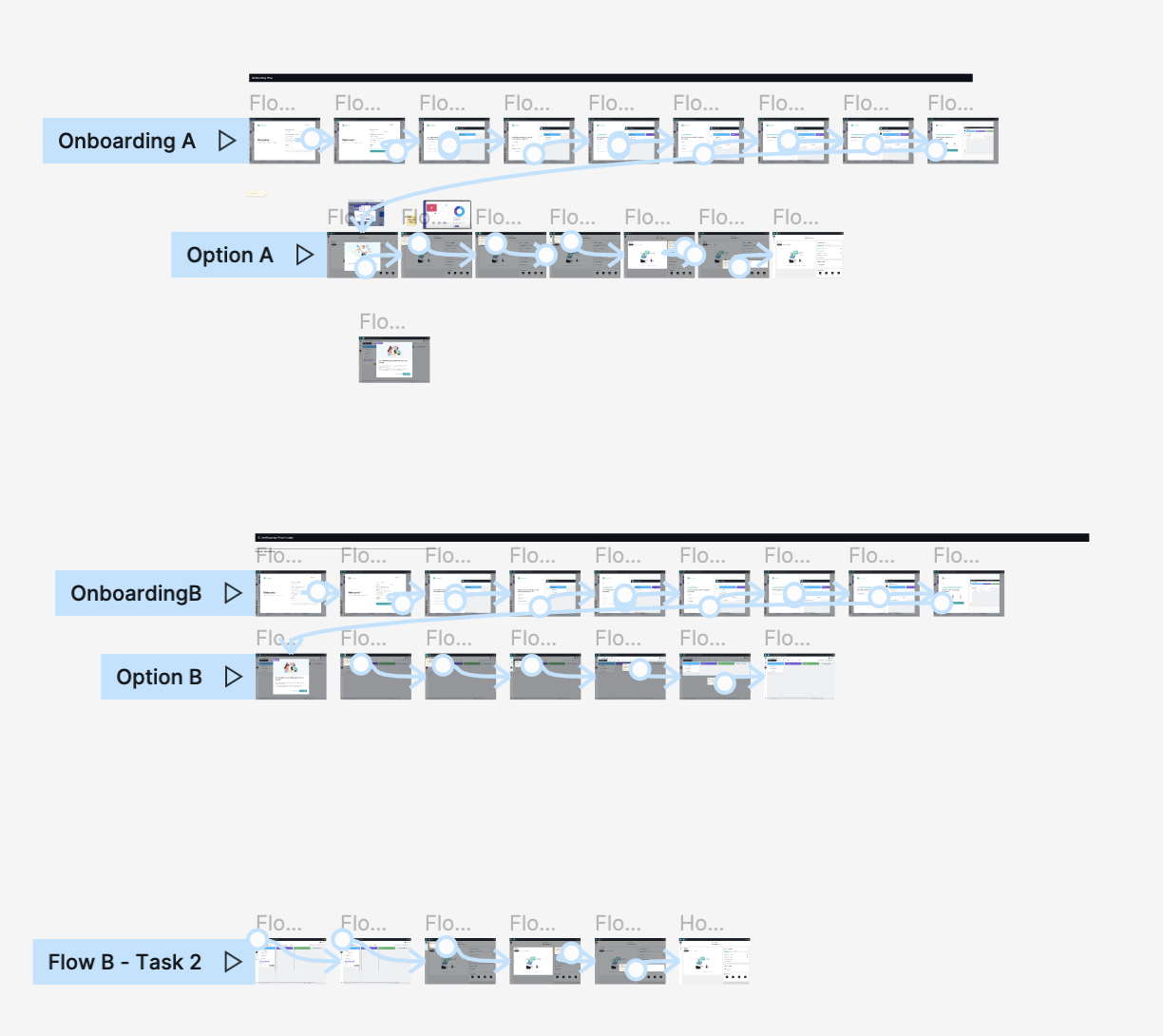
User Journey Map & Product guide contents
I created a table to analyze each menu within the organization space and identify potential points, scenarios, and content that can be incorporated into a product tour. This table serves as a visual reference to outline the specific areas where a product tour can be implemented.

AB Testing
We deliberated on the ideal initial landing page for both new and existing users. We weighed the options of using either the homepage or the project page. To determine the best choice, we conducted AB testing with users using the Maze link.
Interestingly, the majority of new users preferred the project page as their initial landing place. They expressed a desire to immediately see the projects they had created during the onboarding process. Users thought that the project page offers a more coherent and result-oriented flow. However, for subsequent visits, we decided to direct users to the homepage.
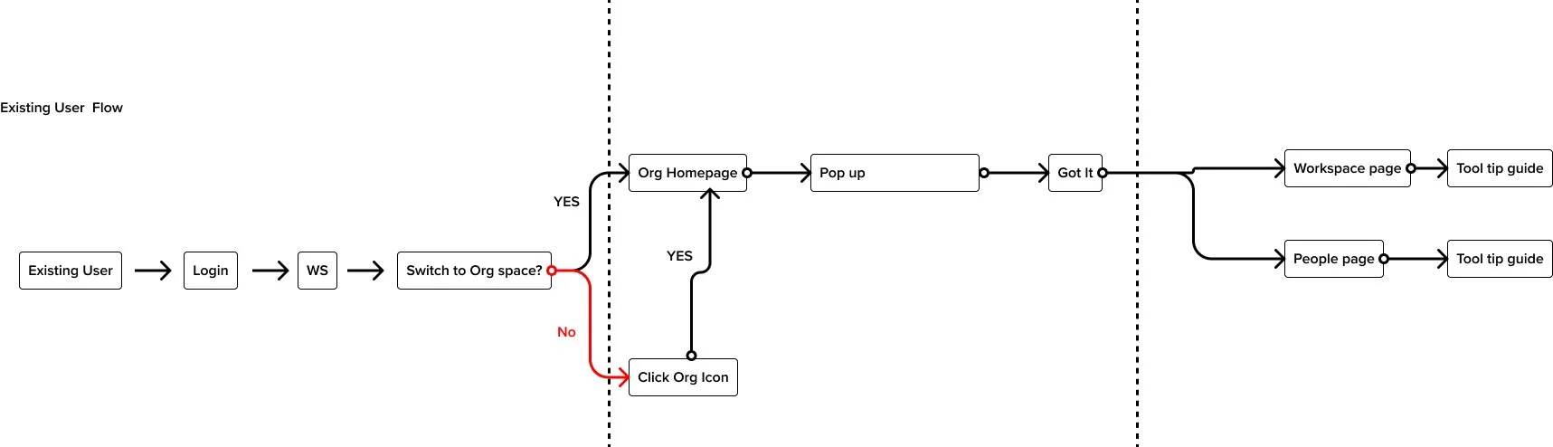
To ensure a seamless experience for existing users, we made the deliberate decision to show them the page they had last visited upon their first return to the organization space. This approach was implemented to prevent any surprise or disruption in the morning when they log in.
User flow
In order to strike a balance between providing a concise tutorial and allowing users to freely explore new features, we made the decision to avoid interrupting users and overwhelming them with excessive guidance. Our objective was to design a short tutorial that offers sufficient information without irritating users or causing them to miss out on important details.
I carefully considered how to create a tutorial that effectively communicates key concepts while being non-intrusive. The tutorial was designed to be seamlessly integrated into the user experience, ensuring that users can easily access and engage with it at their own discretion. This approach enables users to have the freedom to explore and experiment with the new features while still having access to valuable information when needed.
Design proposals
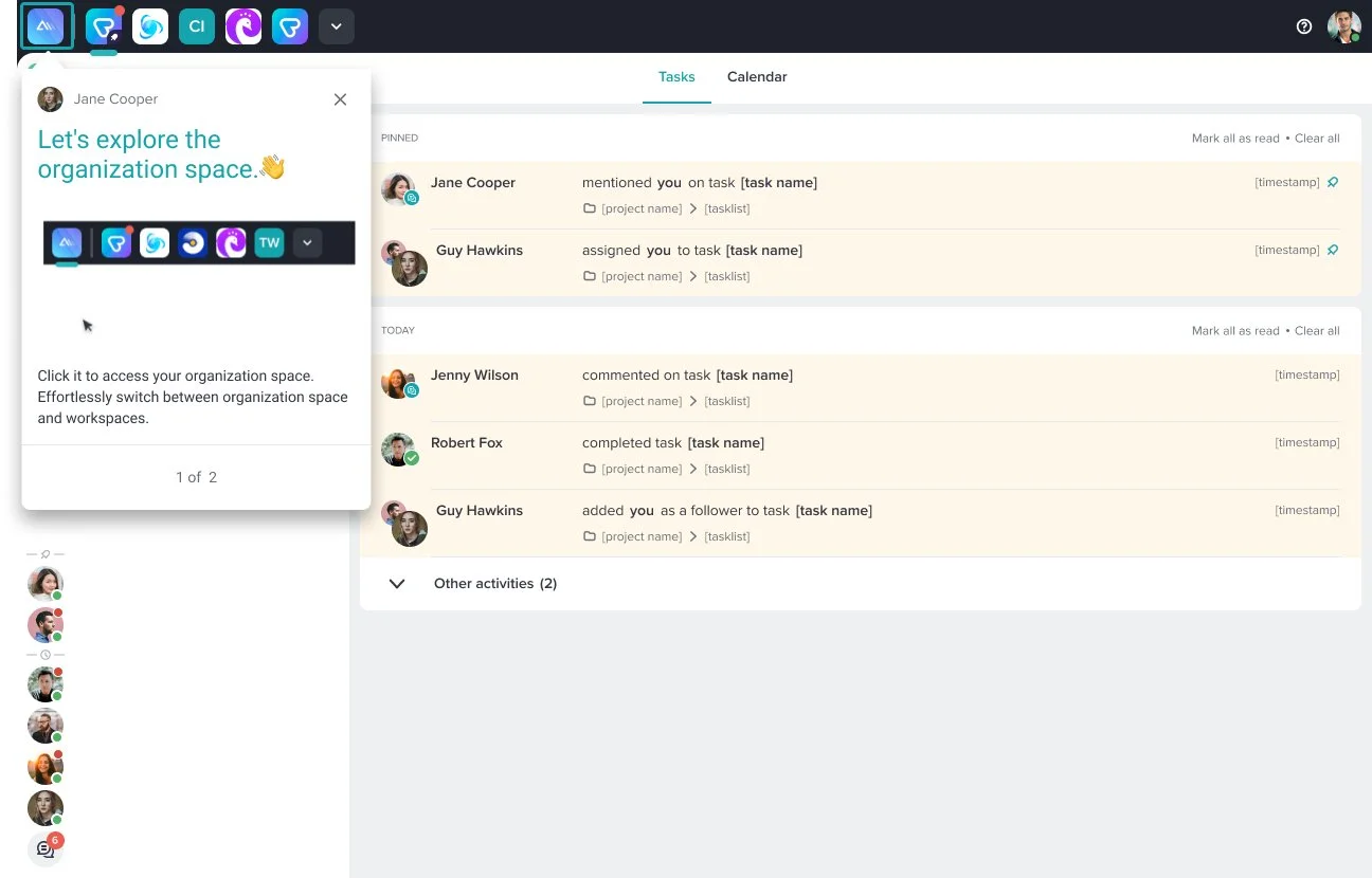
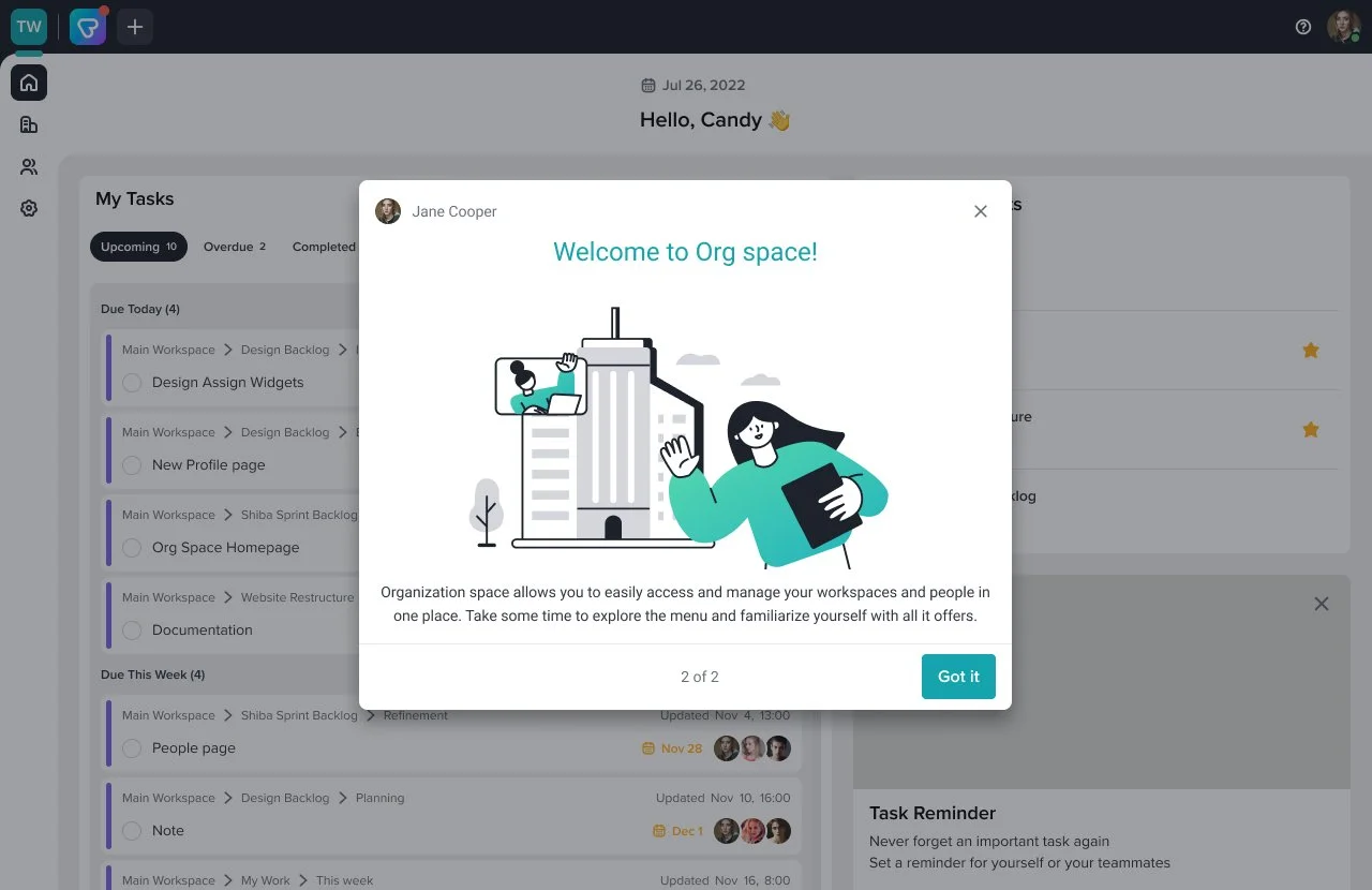
Upon logging in, existing users will be directed to the page they were last on, ensuring a seamless continuation of their workflow. To assist them in accessing the organization space, a tool tip guide with a GIF image will be displayed at the top of the page. By clicking on the organization icon button, users can easily navigate to the organization space. Once there, they will encounter a tutorial popup , providing them with guidance and instructions on how to effectively utilize its features.

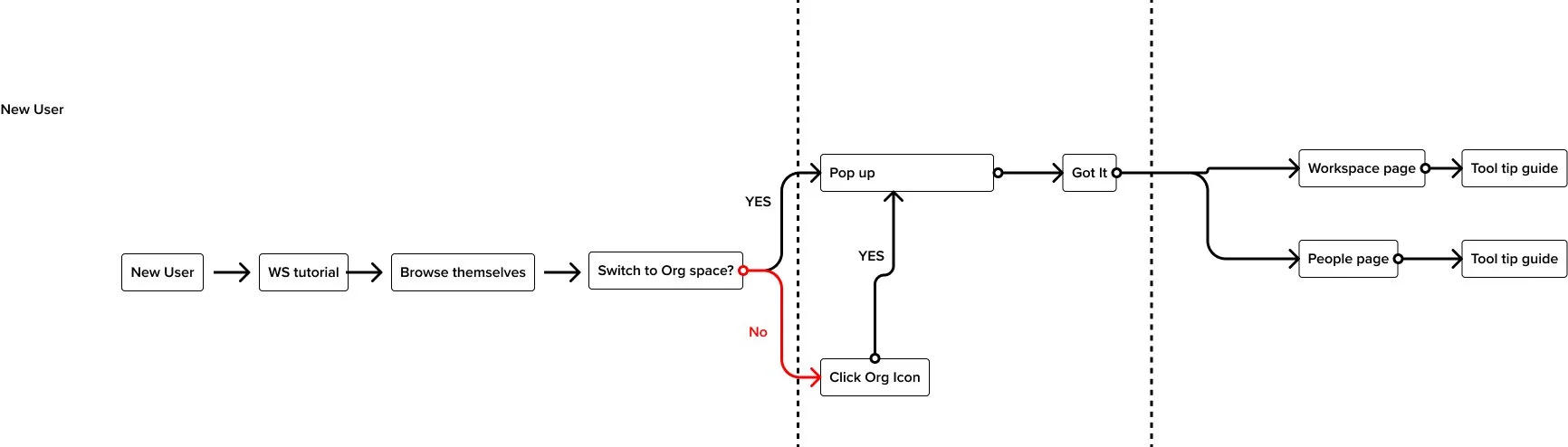
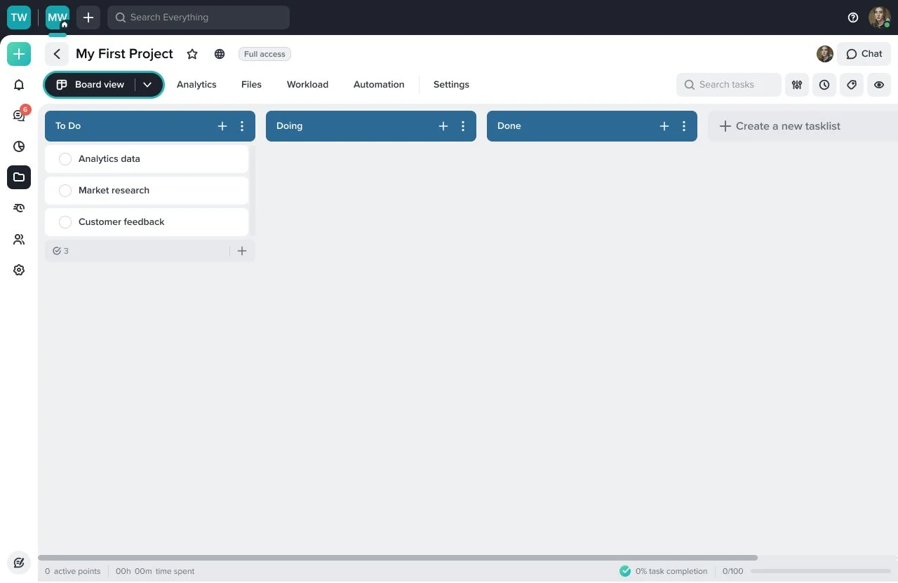
To avoid overwhelming new users who have already gone through the onboarding process and received guidance on the project page, I have designed a user-friendly approach. I want new users to have the freedom to explore and familiarize themselves with the project page.
Once new users feel comfortable and ready to proceed, they can click on the organization button located at the top of the page. This action will seamlessly navigate them to the organization space. At this point, they will encounter a tutorial specifically tailored to the organization space, providing them with valuable guidance and instructions on how to effectively utilize its features.
workspace guide
When user click workspace menu, they will find one tool tip guide which introduce how to manage workspace effectively in this page
People page guide
When user click people page, tool tip will provide simple instruction about what users can do on profile page
Profile page guide
When user click the profile as the above guide, they will find one more guide which can help admin users manage one’s workspaces at once on this page.
What I learned…
Scoping
Since this project was quite big, we undertook multiple rounds of research to comprehensively address all aspects of this feature. Our users expressed numerous expectations, but for the MVP, we had to carefully choose key features that would be showcased initially. The intention was to gather feedback and enhance the features in subsequent iterations. Throughout this process, we engaged in discussions with various teams, including product, marketing, and developers. These interactions provided valuable insights into scoping the essential features that would deliver value to our customers in the MVP. We collaboratively defined primary goals and identified the features that fell under the categories of "must-have," "could-have," and "would-have."