
Dashboard
Ⅰ. The Overview
My Role : Product Designer
User Research, Ideation, Wireframe, UX/UIDesign
Tool : Miro, Figma
Duration : 05.2023~06.2023
- About Analytic Dashboard
Customers face challenges in managing multiple projects, tasks, and team members within a single workspace. They expressed the need for an overview that allows them to efficiently manage people and tasks across all projects.
- The challenges
Figure out what data users wish to view on our dashboard and identify valuable insights we can provide
How to efficiently present the data using specific types of graphs
Ⅱ. Design Process
The objective of this project was to enhance reporting and analytics features within our product.
To gain insights into the pain points of our customers regarding current data utilization and their requirements for an analytic dashboard, we conducted interviews. Subsequently, we had meetings involving the Product Owner, Head of Developers, and Data team to define the project scope and determine the optimal way to present the dashboard. During this phase, it was decided to embed the dashboard for the minimum viable product (MVP) while incorporating designed product filters for an enhanced overall user experience. Once the analytical dashboard structure was finalized, we collaborated with the Data team to generate ideas. On the other hands, I also created filter designs and handed over to developers.
Discovery
The primary requirements identified were the effective management of bottlenecks to meet deadlines and the efficient monitoring of team performance.
Customers expressed their desire for user-friendly functionalities such as diverse filters and the ability to export data to Excel in order to generate reports for various purposes. Therefore, the importance of customized dashboard was not significant to users.
For the minimum viable product (MVP), we made the decision to incorporate an embedded preset dashboard to ensure a swift release and promptly incorporate customer feedback for easy improvement.
Competitor Analysis
From the beginning, I started competitor analysis to understand what features are included in task management dashboard and draw some inspiration from competitors.

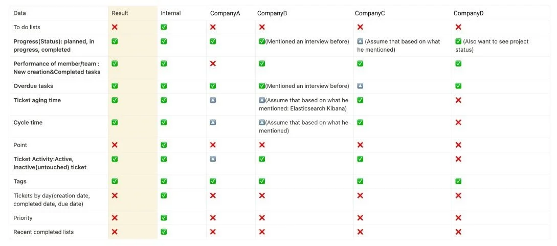
Interview Results
Following that, I conducted an internal survey and internal interviews to determine the specific data that our internal users desired to have displayed on our dashboard. Utilizing the findings from the internal research, I compiled a list of keywords. Subsequently, we scheduled external interviews with our customers to compare their needs with the list of data keywords derived from the internal research.
Upon completion of the external interviews, we organized brainstorming sessions to identify the common data keywords that were in high demand among most users for inclusion on the dashboard.
2. Ideate
I engaged in brainstorming sessions with colleagues and the data team to determine the graph style and top filters. In this phase, we faced challenges in choosing the graph due to a gap between user preferences and technical limitations. Users expressed a desire to view the cycle time of specific columns on the Kanban board, but there were pre-existing data prepared by the data team that posed constraints. As a compromise, we decided to display the lead time from creation to completion, meeting the minimum requirements of customers for the MVP, while the data team prepares the necessary data for the next phase.
we also decided to place the dashboard icon button in the left navigation bar. Previously, it was concealed within the workspace button on the top navigation.
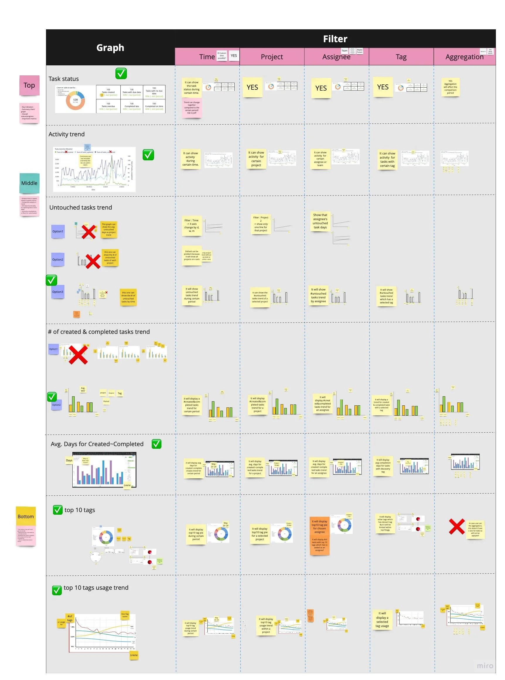
Graph style & Usage
I explored different graph styles and examined the utilization of each graph to present data in an efficient manner.

Brainstorming
The selection of the top filters has been finalized : Date, Project, Assignee, Tag, and Aggregation.
We have determined the appropriate graph style for displaying the data and also defined the insights that will be provided using this chosen visual representation.
It is crucial to examine the impact of the top filters on each graph and ensure their compatibility and coherence across the entire dashboard.
Wireframe
Once the widgets were finalized, I developed rough wireframes to share the layout and graph style with the data team.
On the other hand, we decided to display a product filters, so I designed filters on top and handed over to developer.

3. Final Design Solution
We have launched dashboard feature MVP and are checking customer feedback. Our next course of action will be enhancing the existing charts and integrating certain charts that were excluded from the MVP due to challenges with database integration.


Top of the dashboard
01. Task status
To enhance user comprehension of the overall task status within the workspace, we positioned the task status at the top of the dashboard. The left section presents the numbers corresponding to each task status and also displays the percentage comparison with the previous period. This feature enables users to easily grasp the extent of task increase or decrease in relation to a specific timeframe.
Middle of the dashboard
01. Created & Completed tasks
Users can view the count of tasks created and completed, organized by date. This feature allows users to track the number of tasks generated and finished within a specific timeframe
02. Task activities
On the left side, the dashboard displays the average duration from task creation to completion. This information provides users with an understanding of the typical time it takes to complete tasks.
The right side of the dashboard displays the task activity trend, revealing the frequency of comments over time. Previously, users had to manually check each task for comments and updates, potentially causing bottlenecks. However, with this graph, users can quickly assess the activity trend for specific projects, individuals, and more. It becomes easier to identify any decrease in activity and take necessary follow-up actions.
End of the dashboard
01. Overdue tasks
The right side of the dashboard displays the overdue task by date. Users can filter project, duration, assignee and easily manage overdue tasks trend.
02. Top10 tags
To provide valuable insights into the usage of tags by our users, we have included a section that showcases their most frequently utilized tags. This chart allows users to gain an understanding of which tags are being widely used, helping them to understand specific information regarding ongoing project statuses or the amount of work completed associated with each tag.
What I learned…
This project was intriguing as my primary collaboration was with the data team rather than the developers. The decision to embed a dashboard prompted frequent catch-ups with the data team during the ideation process. Our discussions revolved around determining the feasibility of incorporating specific types of graphs, considering the constraints of the embedding tool. In cases where our initial suggestions were not feasible, the data team provided alternative solutions and explained the possibilities. This collaboration with the data team proved to be an engrossing experience, allowing me to learn how to ideate effectively across different teams.